Skip to content
Tvorum.
Concept

Nexa Academy — website concept for an online school

An online-school landing page that works like a course player: drag the timeline and watch a student’s gray wireframe turn into a portfolio case study over 16 weeks.

Demo UI in Ukrainian — we build in any language.

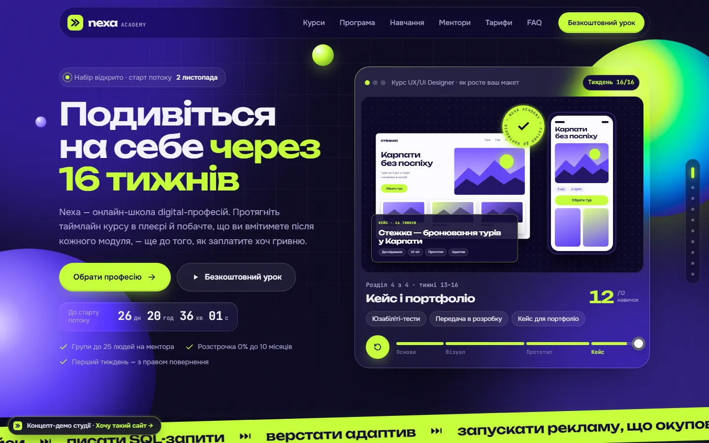
Nexa Academy — homepage screenshot

This is a concept, not a client project. The brand, people and data are fictional; the code is real. It was built for the Ukrainian market, so the demo interface is in Ukrainian. Order a site, and with your permission it becomes our next real case study.

Industry
Online school
Site type
Landing page
Year
2026
Format
Studio concept

The task

What the site had to do

An online school doesn’t sell videos — it sells a career change, an expensive and scary decision. People compare five to seven schools, and they all promise the same thing: “top mentors”, “95% job placement”, “a new career from zero in 3 months”. Nobody believes those numbers anymore, while the real doubts go unanswered: can I do this with no experience, how many hours a week will it take, what exactly will I be able to do, and how much will it cost each month.

The site had four goals:

  • Show the learning outcome before payment — through concrete skills and work, not job-placement promises.
  • Help choose a course in a minute — among nine programs in five tracks, by level and duration.
  • Handle the price objection — transparent plans, pay upfront with a discount or in interest-free installments from the school.
  • Capture warm leads — through a free lesson and a countdown to the next cohort, not pushy “only 2 seats left”.

The solution

Design and UX decisions

The idea — rewind. The whole landing page is built as a course player. The hero is a live mockup: drag the slider through 16 weeks and the student’s layout evolves from a gray wireframe to a polished UI, a responsive prototype and a finished case study stamped “Portfolio-ready”. The course section and a skills counter update alongside. The clip plays by itself when the player scrolls into view and stops at the first touch. On a phone the player sits right under the headline — the “wow” is visible without scrolling.

Tech aesthetic without stock. Deep indigo and violet, acid lime as the only accent, frosted-glass cards and gradient 3D spheres drawn in pure CSS. Section navigation reads like timecodes — “01 / Catalog”, “02 / Syllabus” — with a side section scale on wide screens.

A catalog that leads to an application. Filters by track, level and duration instantly rebuild a grid of nine courses; on a phone it becomes a horizontal swipe rail. The “Syllabus” button opens a course page right on the landing: a course passport with price, “What you’ll be able to do”, tools, a module accordion with the outcome of each module, and the final project.

The platform from the inside. The “How learning works” block is the student dashboard in HTML/CSS: a video lesson with timecodes, homework, mentor feedback, a live workshop and final-project progress. Switching steps highlights the relevant part of the interface.

Pricing without surprises. Plans recalculate for the selected course, an “installments / pay now −10%” toggle, a comparison table and an installment calculator with a slider for the number of payments. The countdown uses the real date of the next cohort.

Honesty as an argument. No invented placement stats: the FAQ says plainly that nobody can guarantee a job — the school guarantees a portfolio reviewed by a practitioner. The first week comes with a refund right.

Screens

On desktop and on a phone

Nexa Academy — full homepage
The full homepage — scroll inside the frame.
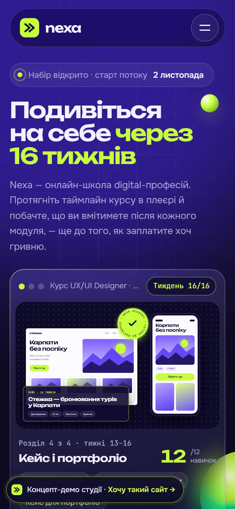
Nexa Academy — mobile version
Mobile version

Features

What’s on the site

  • Interactive course player: a 16-week slider evolves the mockup from wireframe to case study
  • Catalog of 9 courses with filters by track, level and duration
  • Course page inside the landing: skills, tools, module accordion, final project
  • Countdown to the next cohort with automatic date calculation
  • Plans with an “installments / pay now −10%” toggle and a comparison table
  • 0% installment calculator with a slider for the number of payments
  • HTML/CSS mockup of the learning platform with step-by-step highlighting
  • Free-lesson lead form with track selection and validation
  • Modal applications for a course, a consultation and installments, with phone validation
  • Responsive from 390 px, swipe rails on phones, prefers-reduced-motion

Stack

  • HTML5
  • CSS Grid/Flex
  • Vanilla JS
  • CSS container queries (animated course mockup)
  • Glassmorphism and pure-CSS gradient spheres
  • Native <dialog>
  • IntersectionObserver
  • CMS-ready

Concepts are hand-built static sites. For clients we pick the stack by the job: Next.js, WordPress, Shopify or WooCommerce, with a CMS your team can use.

Palette

  • #0A0720
  • #5B3DF5
  • #8B6CFF
  • #C6FF3D
  • #F1EEFF
For your businessNeed a landing page like this?Landing page: prices and process

More concepts

Other projects

All concepts

$0 · 24 hours

Want one like this — for your business?

Tell us about your business. Within 24 hours we’ll send a prototype of your homepage — inspired by Nexa Academy or something entirely different.

  • Free homepage prototype within 24 hours
  • Fixed price and deadline in the contract
  • 5% off for every day we’re late
  • Code in your GitHub from day one
  • 30% off for our first 10 clients

Prefer email? tvorum172@gmail.com

Preferred way to talk

No spam, no sales sequences. We use your details only to reply — see our privacy policy.